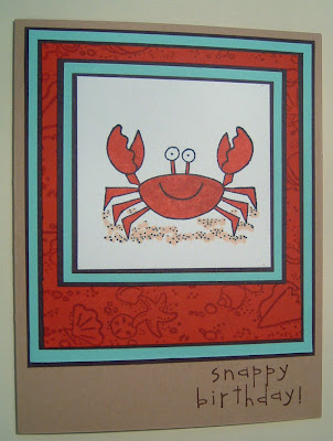
Well, maybe not for eating.
So this card came from a table. I ate at Chili's resturant and our table was really cool looking. I wrote down in my little notebook, "mint, red, tan, brown, ivory" but when I got home I found that Stampin' Up! didn't have any mint. Bummer. Later on a thread on SCS I found out that they used to have a color "mint melody". A good friend sent me a few sheets. Turns out Mint Melody isn't exactly what I had in mind, but I made the card anyhow.
I think when you are using a color you are not sure about you should use it in small amounts with colors you are confident about. That's the Erin tip for the day.

Ok, so the mint is looking sorta blue, but it is green. It's almost exactly that one shade of green that comes in the pastel pack of printer paper. I used to work at a print/copy shop and we used this color a lot. It was one of the cheaper cardstocks we had. So I saw it often. (stinking cheap people, just kidding) So I'm not in love with it. The girl who sent it to me (hi dyu!) labled it "Puke mint".
I colored with copic markers, the stamps are all by Stampin' Up!, colors of paper are real red, chocolate chip, mint melody and creamy caramel.


2 comments:
I think Mr. Crab looks mighty fine in mint and orange. Ok, yeah, maybe now yummy, but pretty instead.
I like this card and your color advice. I have quoted you in my own blog.
http://stampinwinkyfingers.blogspot.com/2008/01/glittery-valentine.html
Thanks for the advice!!
Post a Comment